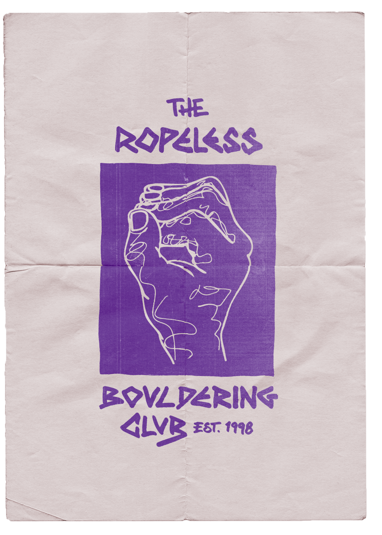
I’m the founder of Ropeless, a bouldering brand. It all started in the late ‘90s when I began collecting and drawing topos of local bouldering areas to make them available to the community. Over time, Ropeless evolved beyond topos into product design and development—something I personally oversee, from concept to creation.
DESIGN CONCEPT
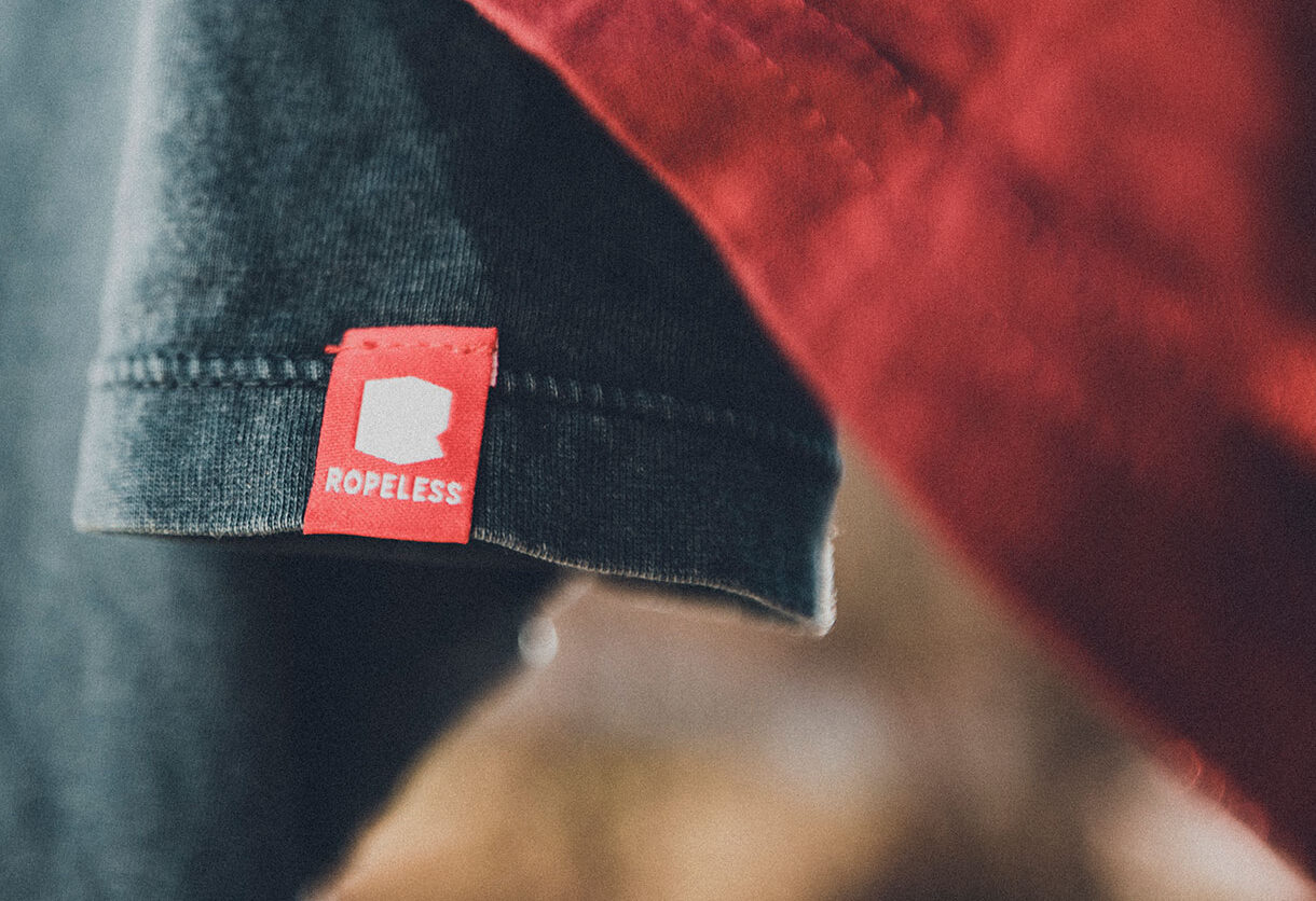
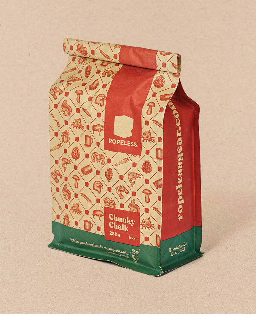
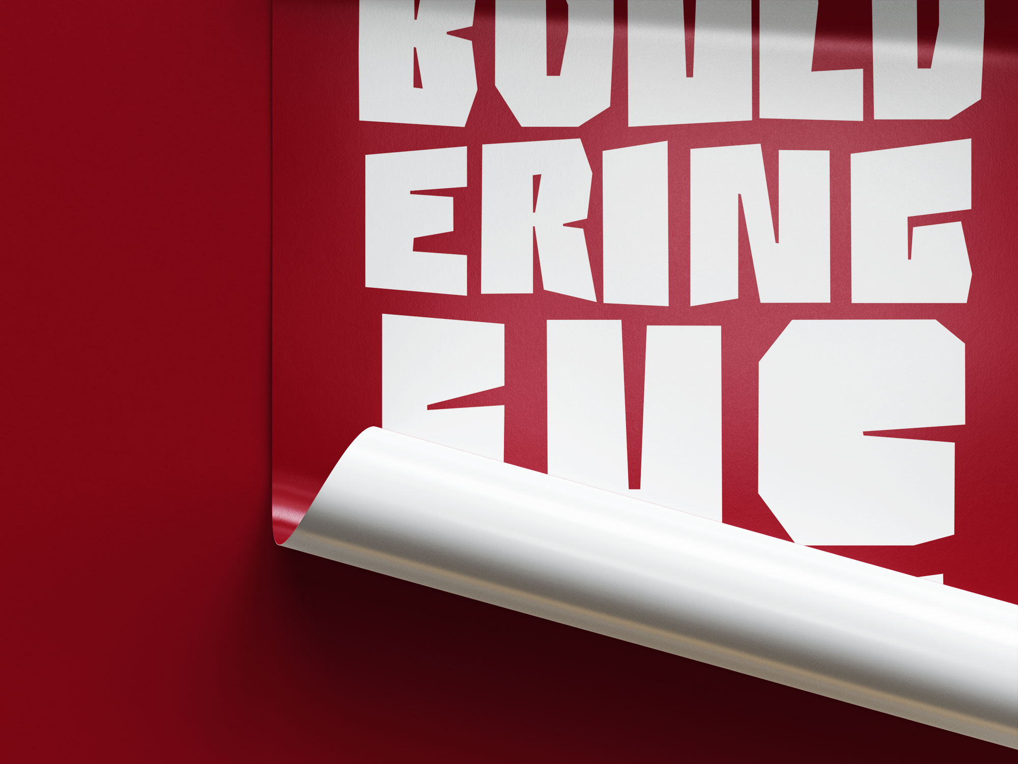
The brand concept was built around a bold color choice as the foundation of the corporate design. I needed something that would stand out, remain timeless, and not just follow fleeting trends. That’s why I chose Karmin Red, a color that cuts through the noise at trade shows, grabs attention on the shelf, and runs like a unifying thread through our entire product line.
“Carmine is a deep, rich shade of red that symbolizes passion—just like ropeless, which is driven by a pure passion for bouldering.”
Calligraphy and Lettering
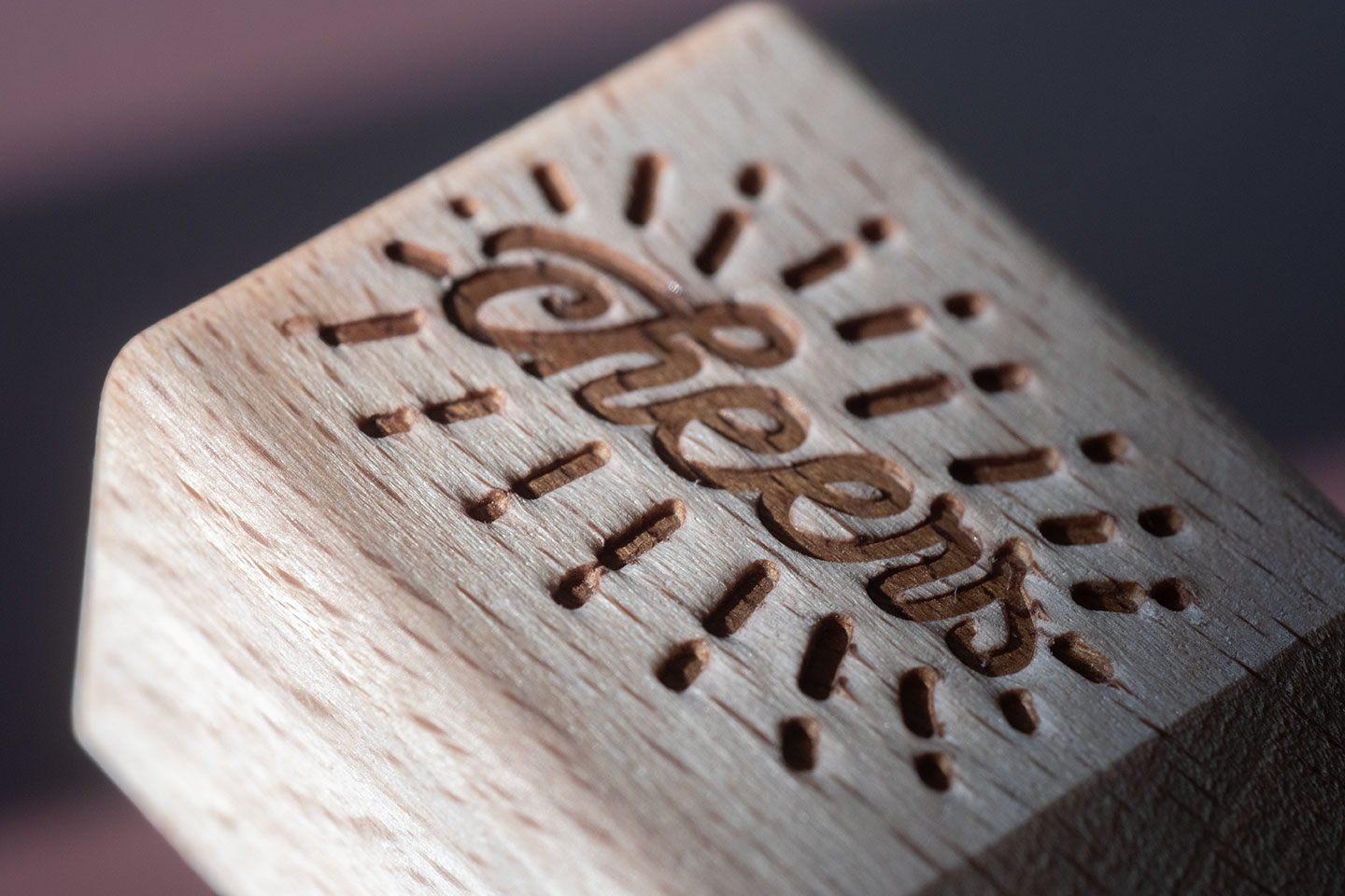
Custom typography, lettering, and calligraphy are essential to the Ropeless design identity. Handcrafted and unique, they reflect the brand’s authenticity, creativity, and deep connection to the bouldering culture. Every letter is intentionally shaped—bold, dynamic, and full of character. This personal touch is ensuring a distinctive and instantly recognizable look.
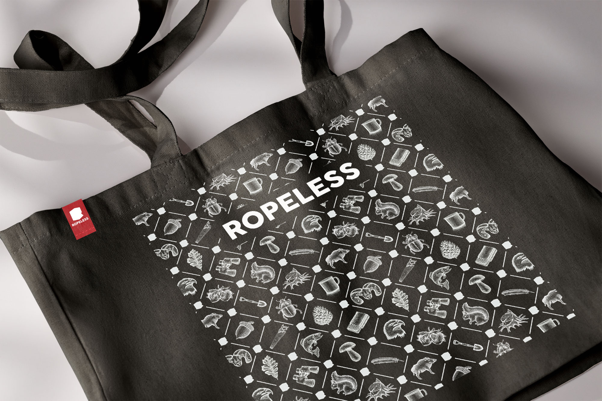
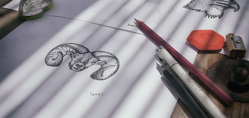
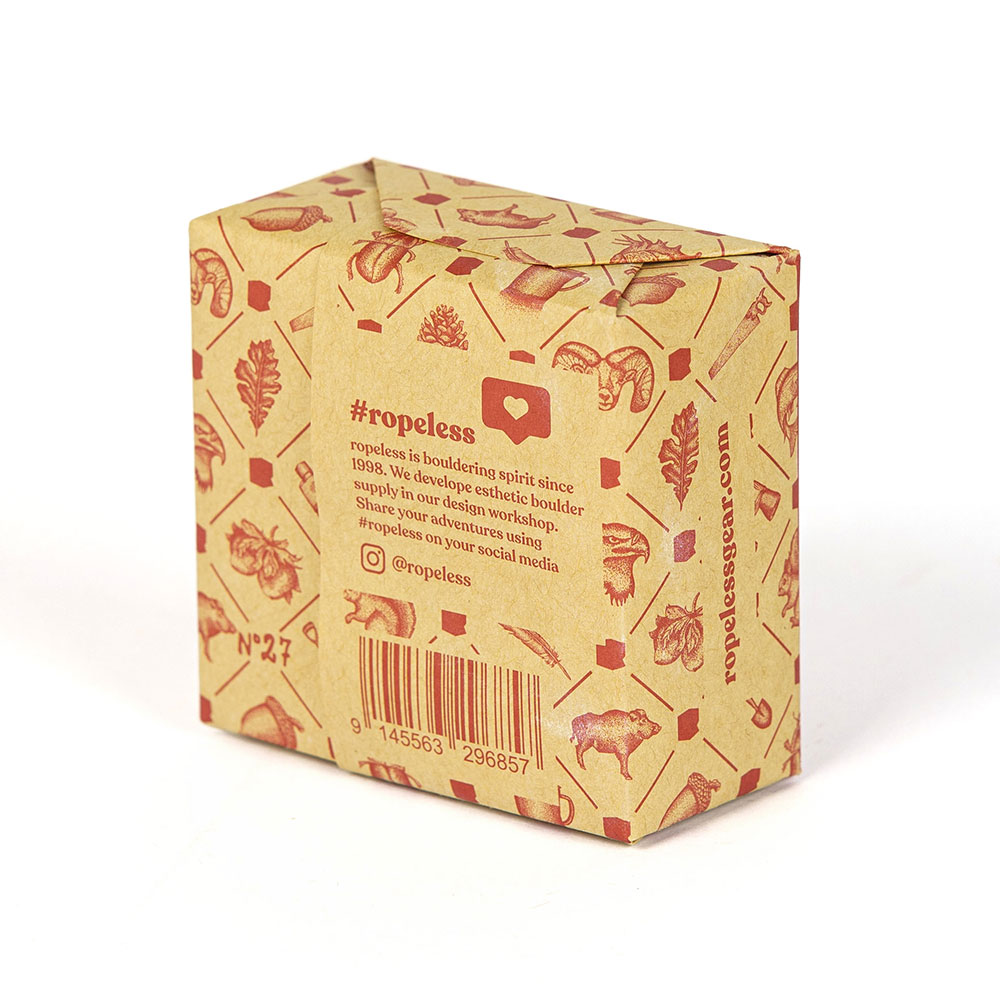
The Pattern
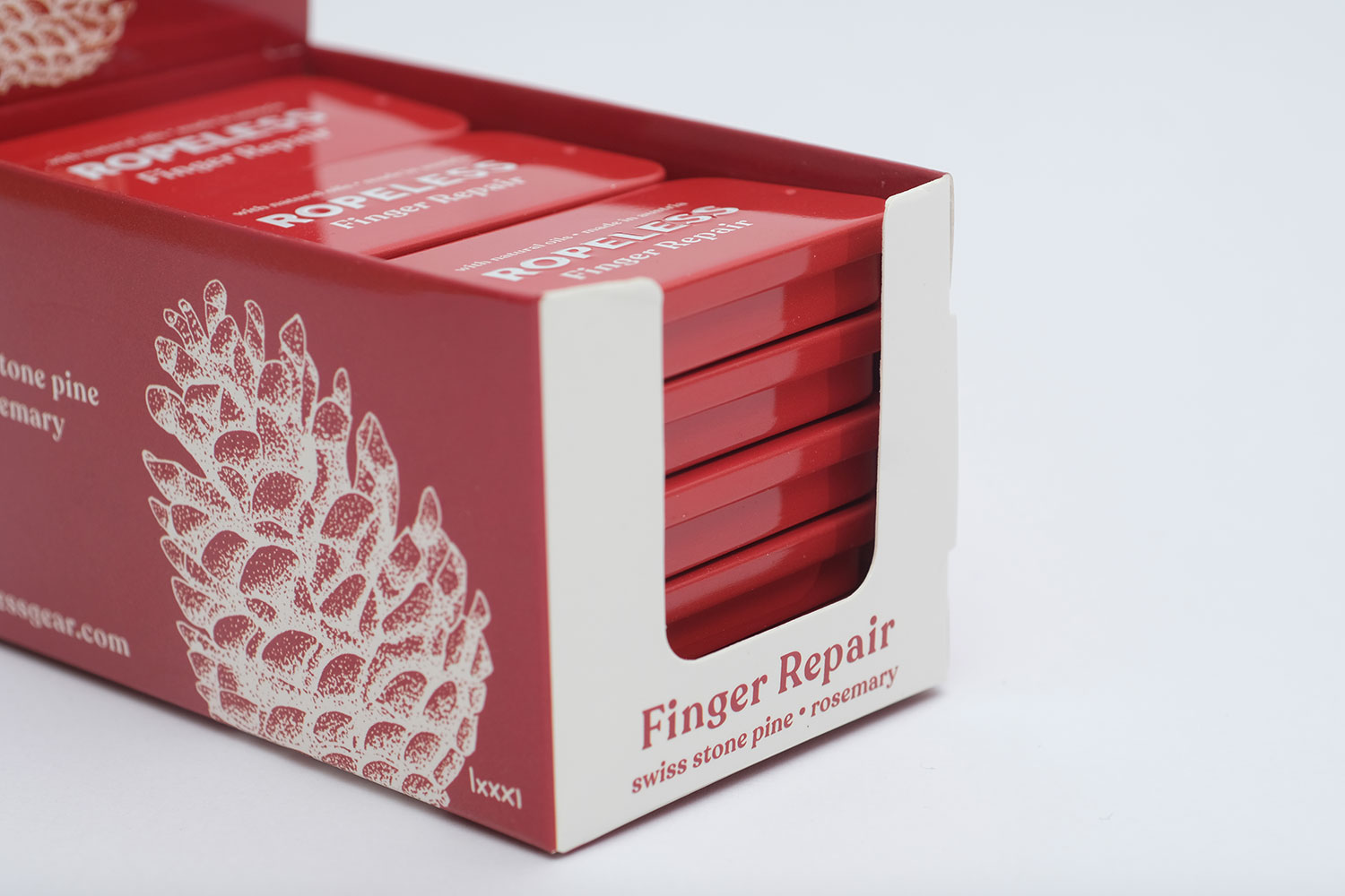
The custom-drawn pattern is a signature element of ropeless packaging, ensuring instant brand recognition. Made up of 18 unique icons—like a bighorn, wild boar, pinecone, etc. —it captures the essence of the outdoors. More than just a background, it reflects the adventurous spirit of bouldering and ties every product to the wild landscapes that inspire us.
Liquid Chalk
Development of a scientifically engineered Liquid-Chalk that utilizes Upsalite. Upsalite stands as the world’s sole mesoporous* magnesium carbonate, capable of absorbing moisture at a rate ten times greater than conventional magnesium carbonate.
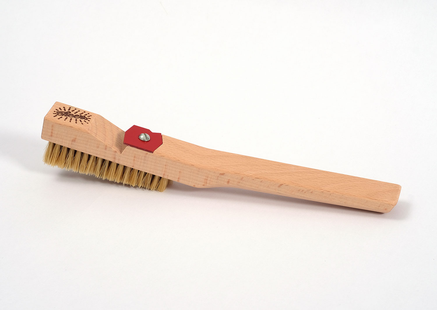
BRUSH
Another bouldering brush ?
Prototyping the most pleasant brush handle and adding this little extra gimmick. Say hello to the first bottle opener which can brush holds too.
Skincare
Product development and Packaging design for a skincare series.
Especially on climbing trips skin is a limiting factor. Taking care of her is inevitable.
Using cremes to make her heal faster, keep the skin even and remove scraps of skin to obviate cuts/flappers.