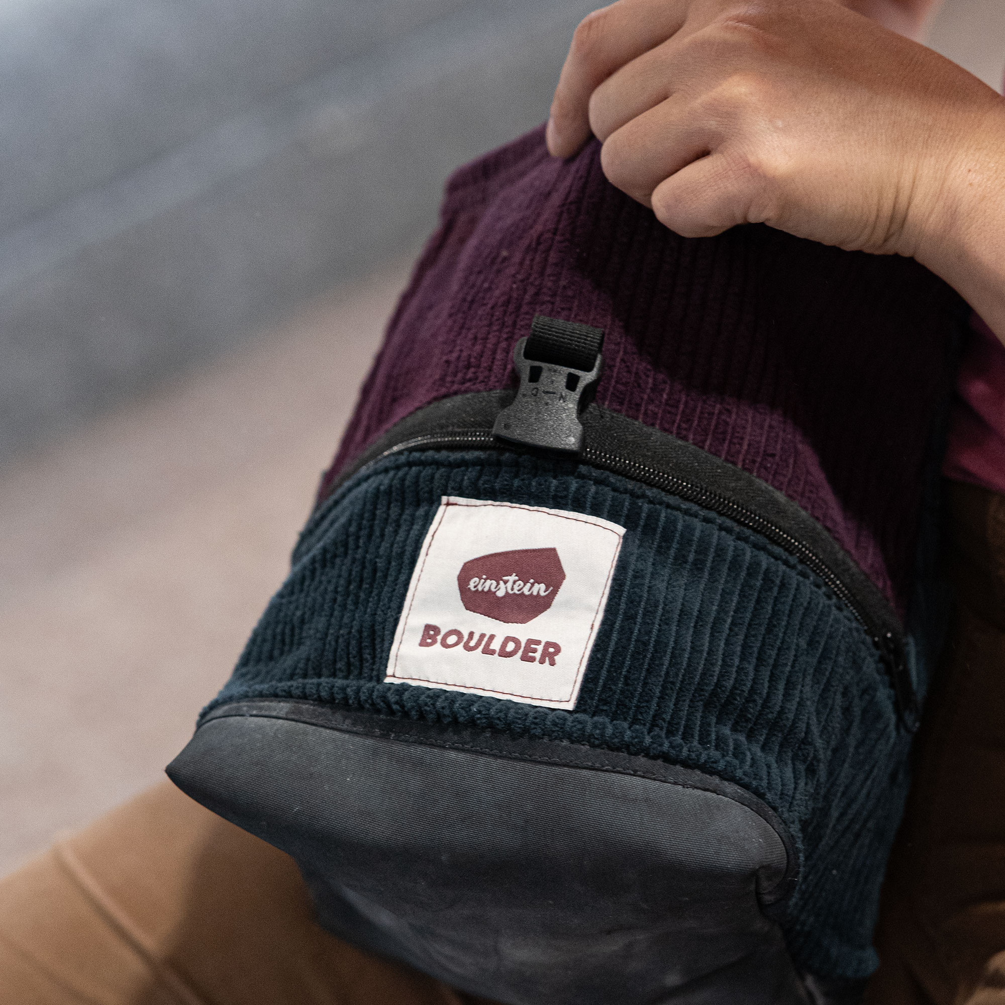
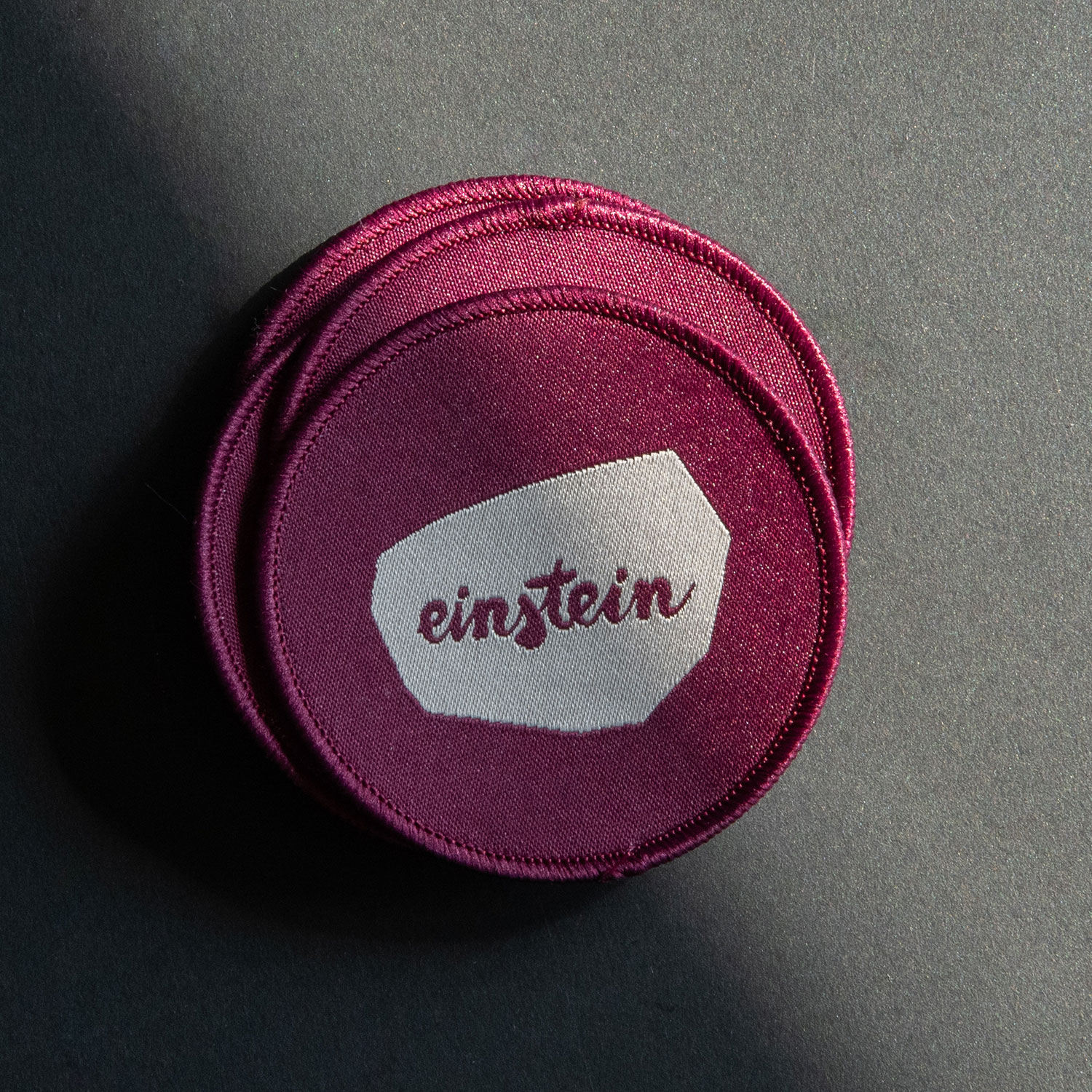
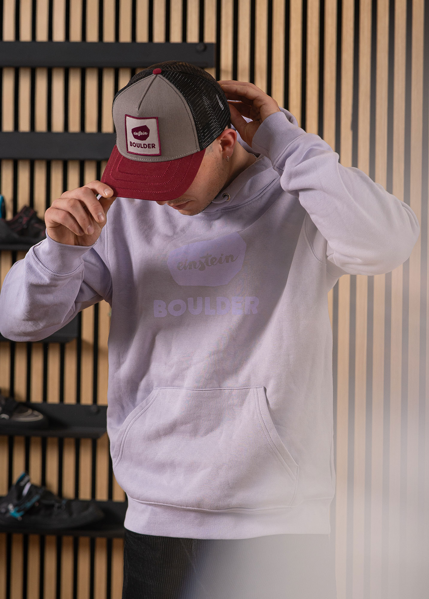
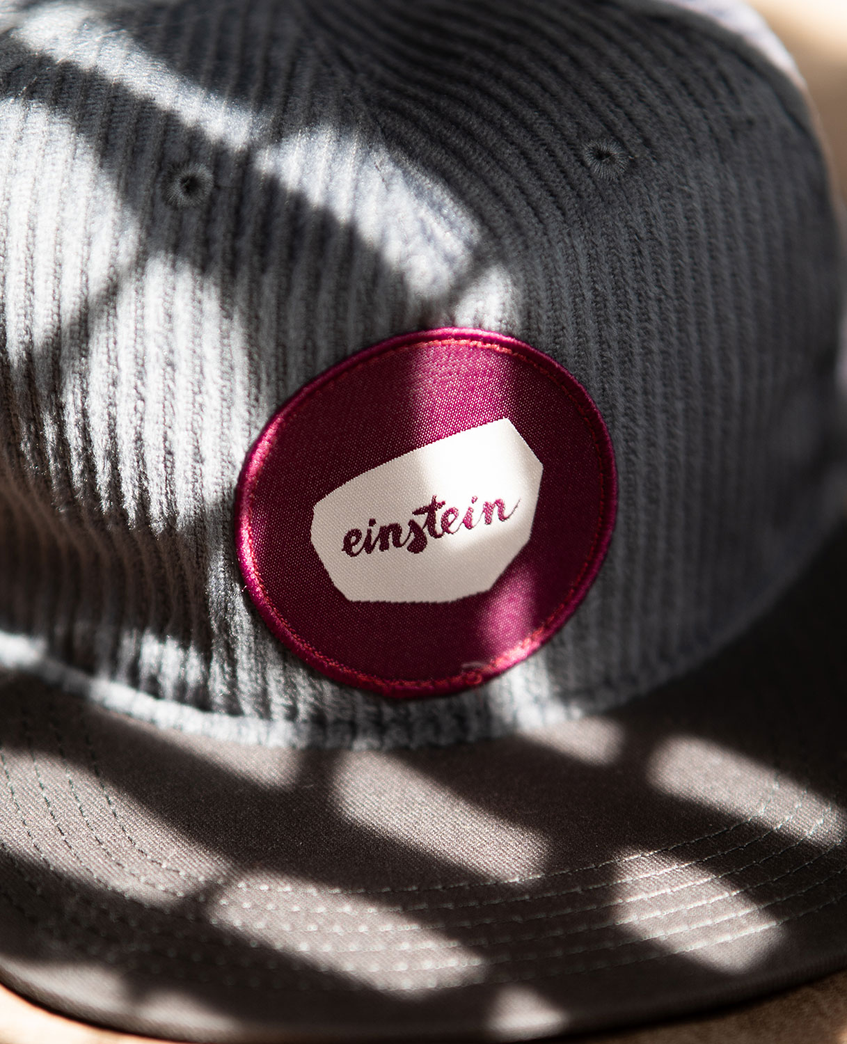
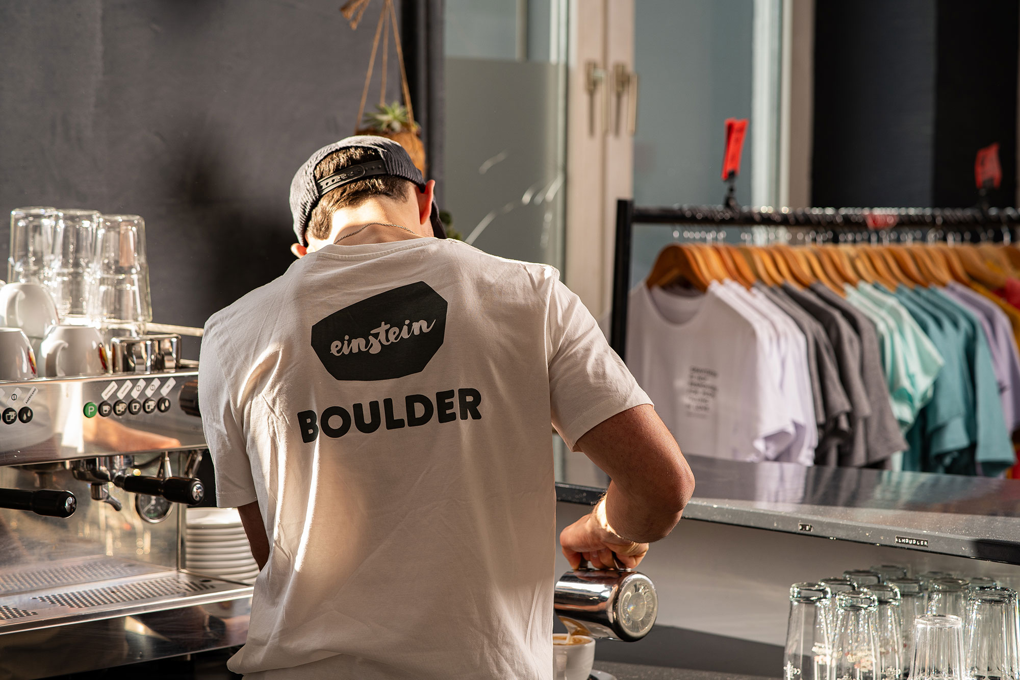
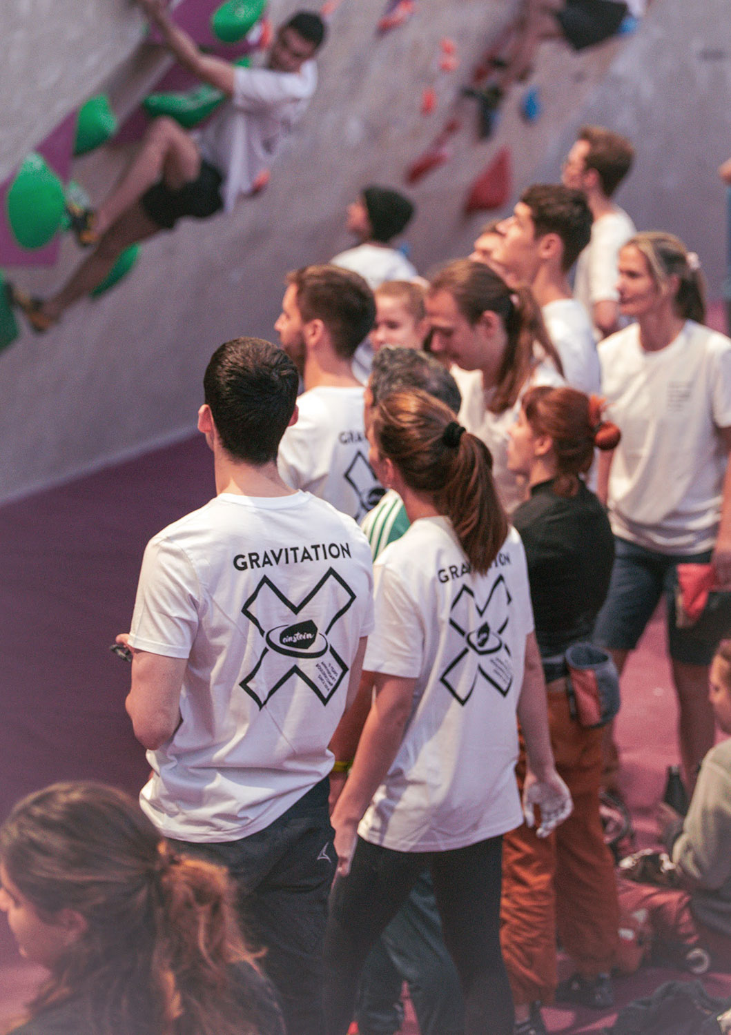
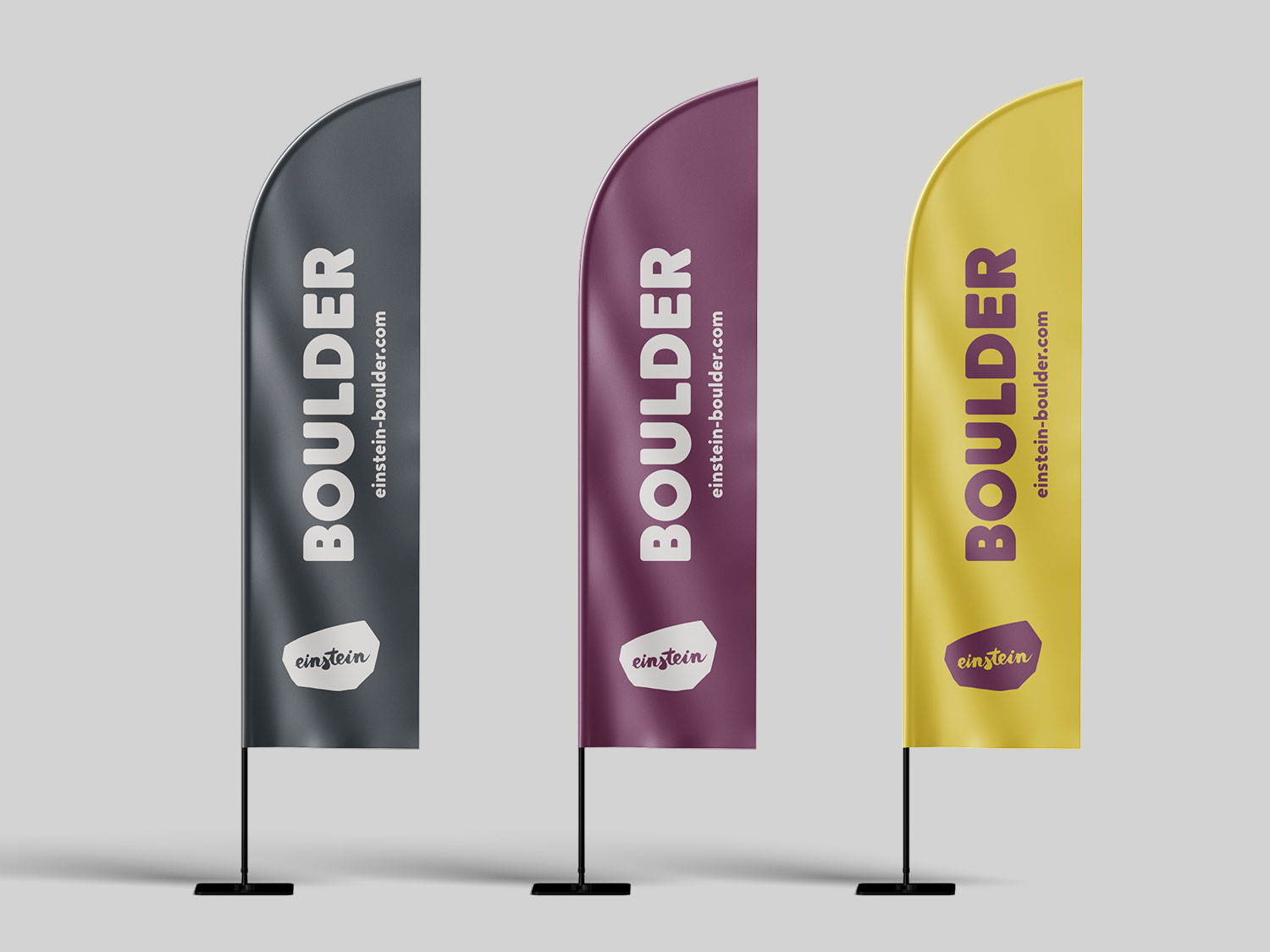
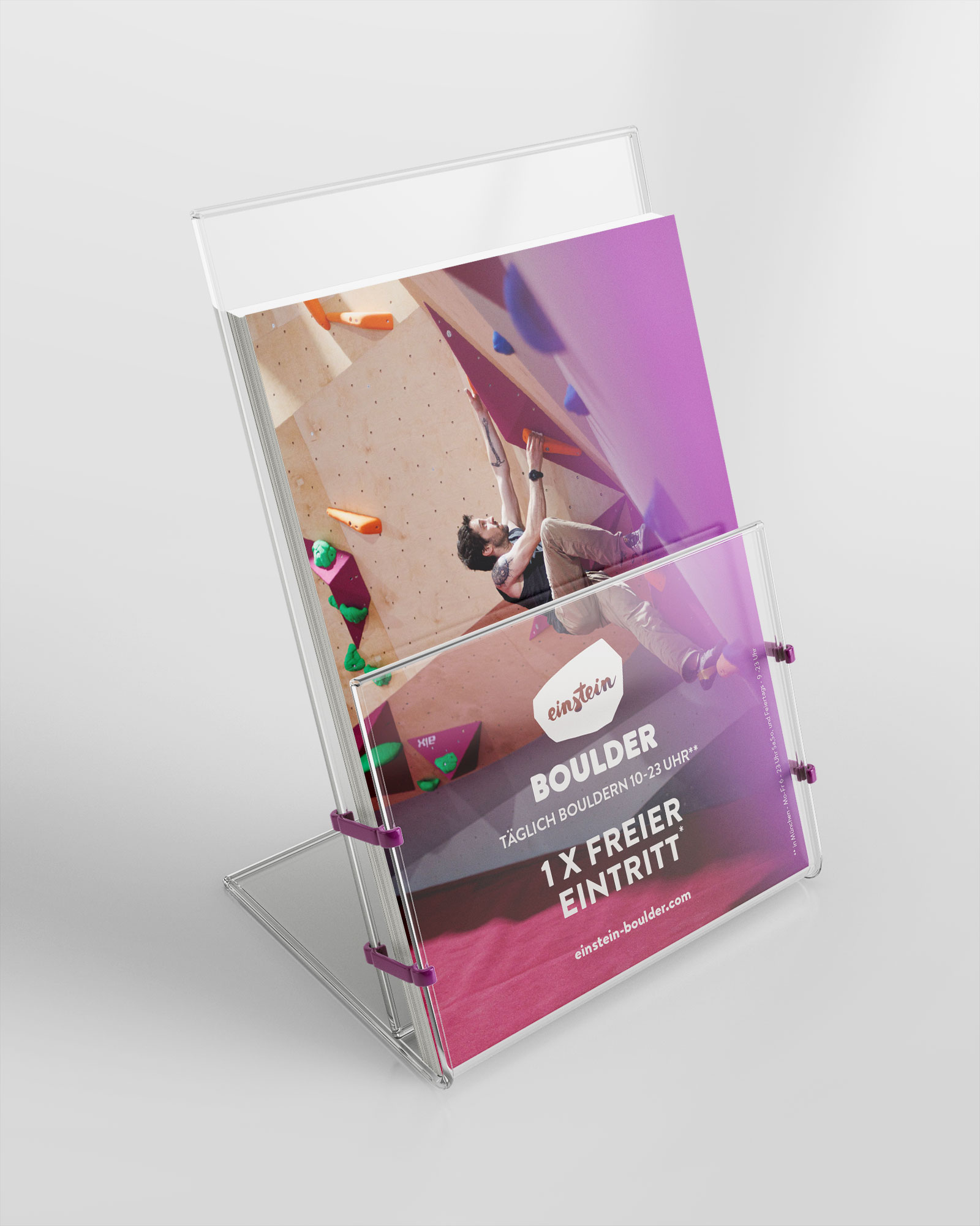
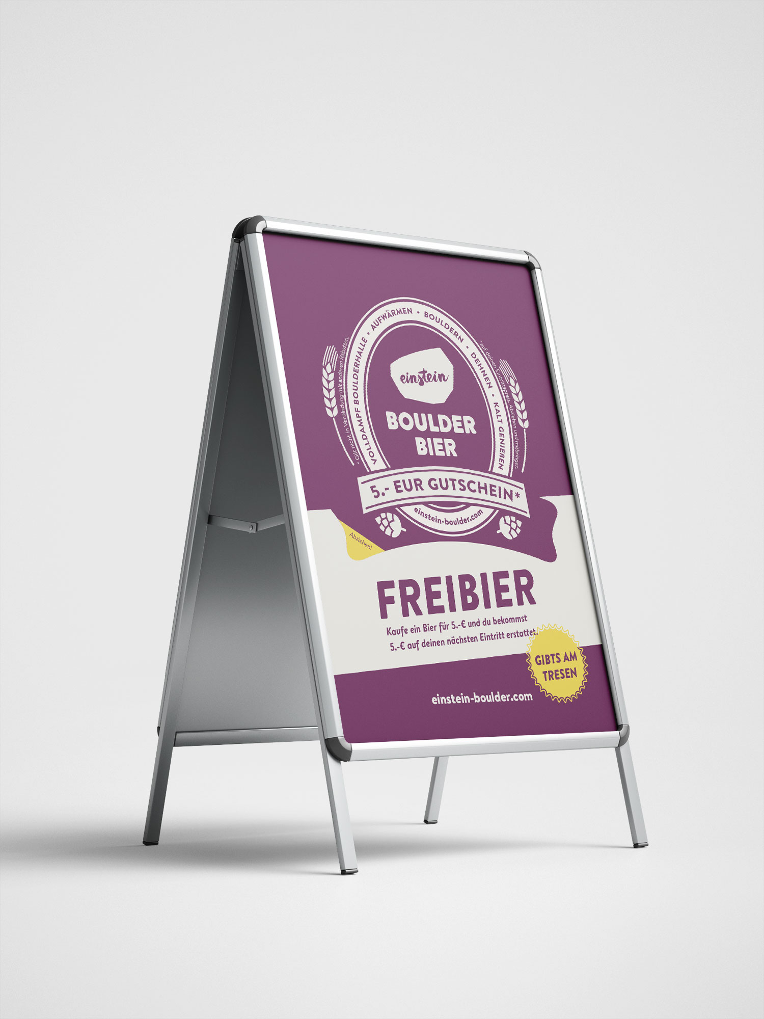
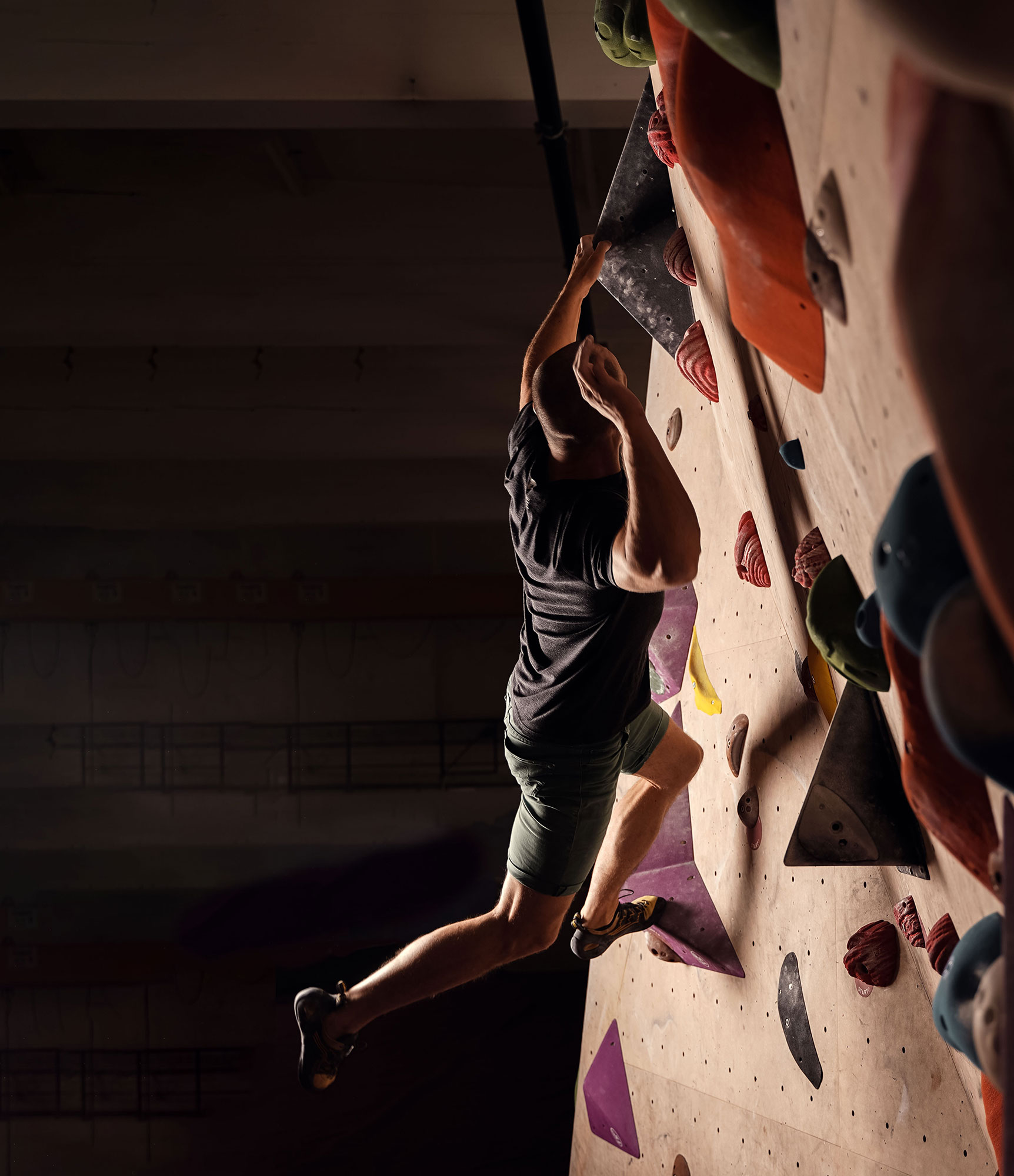
the einstein bouldering gyms were founded 2014 in Ulm - Germany, the birth city of Albert Einstein. The idea for the logo evolved out of the esthetics of a city crest (ulm) and the signature of Albert Einstein (hand drawn logo type). The shape for the crest derived from the outline of the boulderbloc which was placed in the center of the first einstein bouldering gym in ulm.
The Type
When it comes to branding a bouldering gym,
every design choice matters—including the font.
Brandon Text is the perfect typeface for a gym
that wants to balance approachability,
professionalism, and an adventurous spirit.
The Color
Puredeaux the einstein trademark tone — bold, deep, and unmistakable. It’s the iconic carpet color that grounds the space and defines the brand’s presence.
Cream A soft white alternative, echoing the raw textures of bouldering. Cream represents openness, neutrality, and the organic surfaces climbers trust.
Egg A vibrant highlight tone, playful and bright. It’s the spark in the kids’ bouldering cosmos.
Stone A serious, solid presence — echoing the strength and focus of our CrossFit roots. It brings weight and balance to the visual identity.
Together, this color system balances muted confidence with expressive edge. The darker hues create a grounded and timeless impression, while the lighter and brighter tones offer lift, energy, and contrast. This mirrors the brand’s identity: grounded in expertise, bold in innovation, and always visually intentional.
Rollout
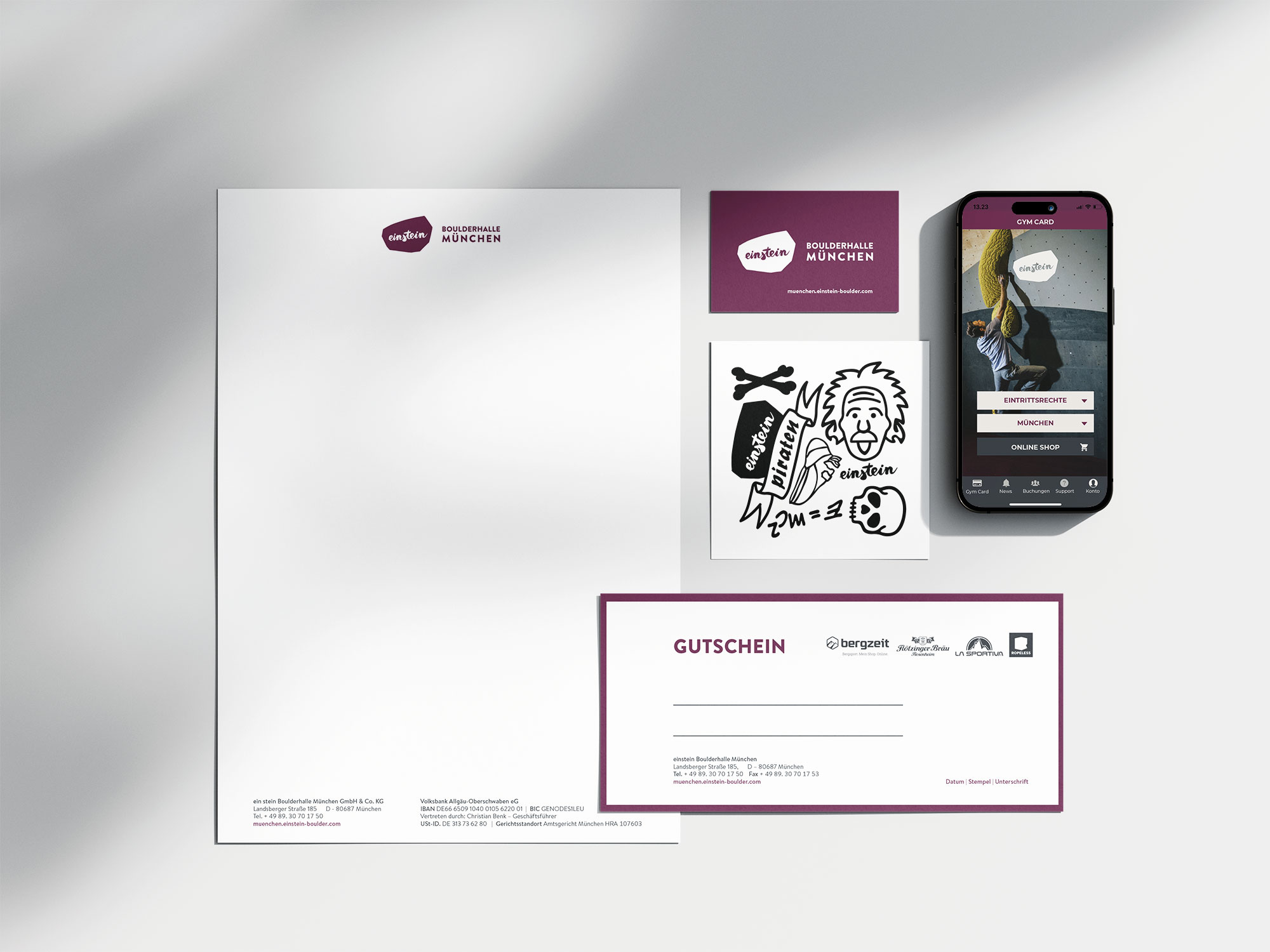
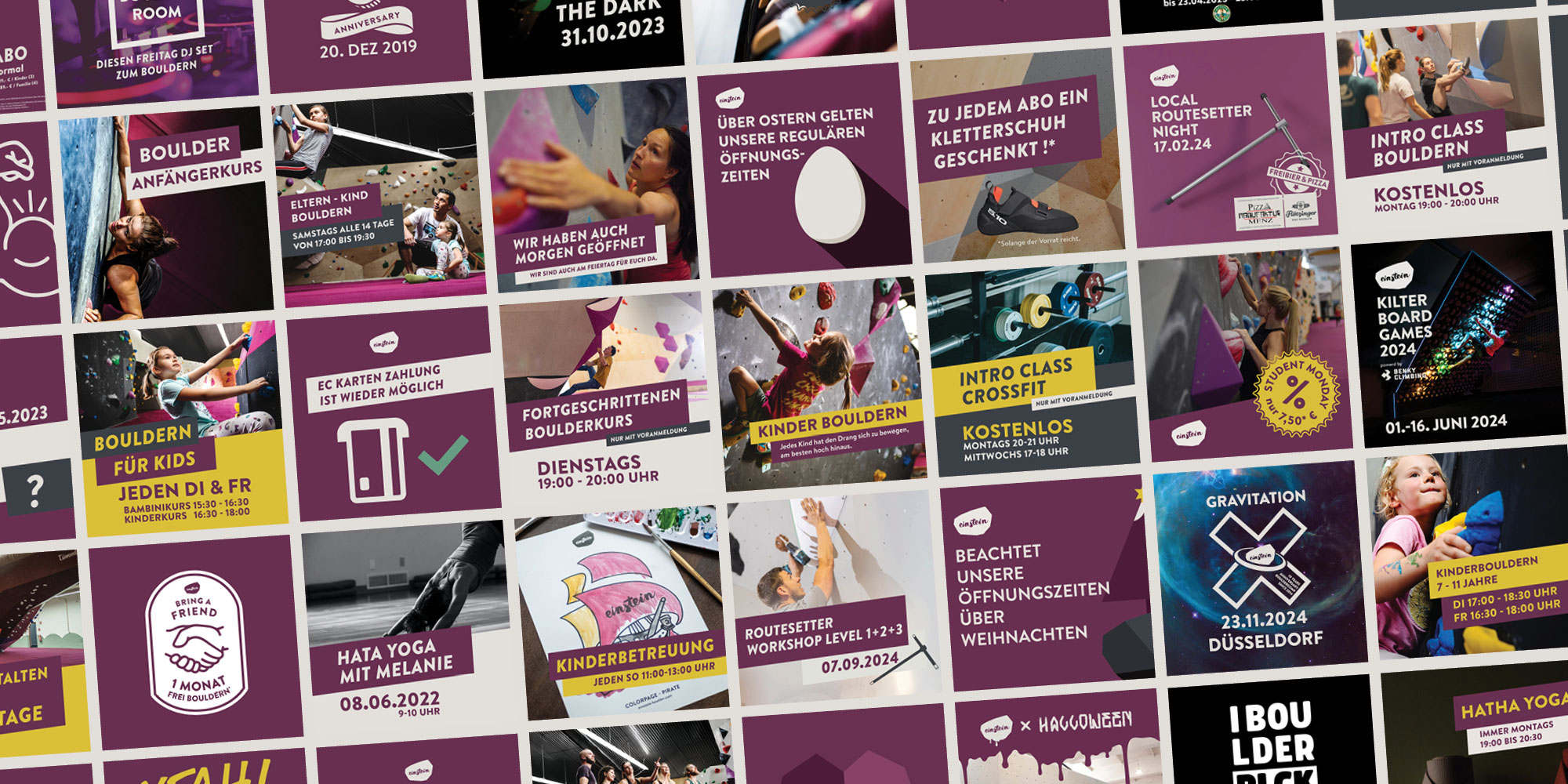
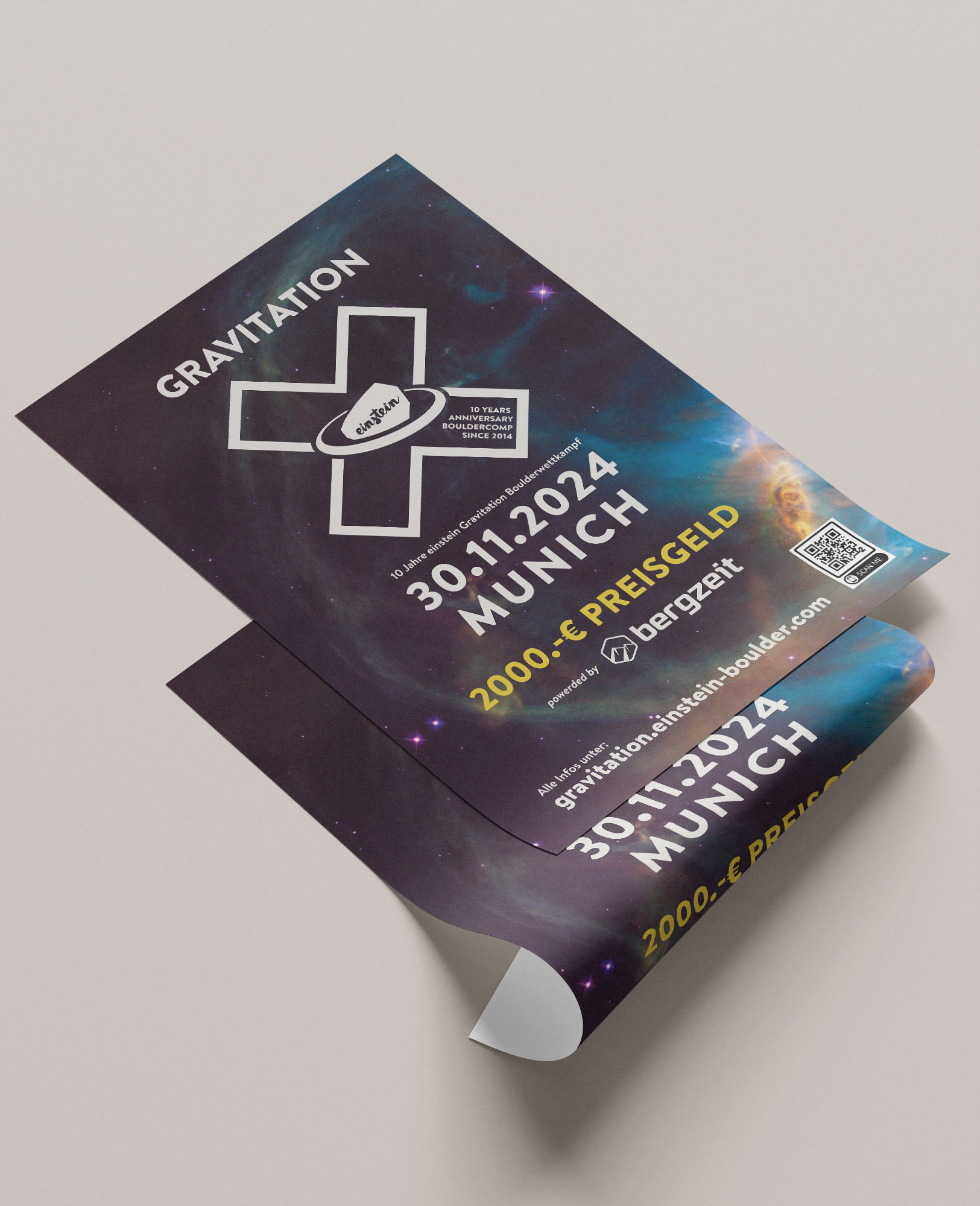
As the chain grew from one to multiple locations, the identity had to work in every new gym without a designer on site. Every location received the same toolkit: templates for social media, courses and events, print files, signage and merchandise. Local teams could produce their own announcements and still look like one brand.
Client: einstein Boulderhallen _ Responsible for the complete creation and implementation of the company’s corporate identity, including: Logo design, definition of color scheme and corporate typography. Development of a cohesive design language across all media. Design and conceptualization of branded merchandise. Overall brand strategy and visual identity.